Problem
This recipe will outline the developer workflow and steps to create new components within XM Cloud.
There are 2 types of components within XM Cloud, the Component Builder (Also called XM Cloud Components, or Front End as a Service) and standard React components. At the time of writing, XM Cloud Components are new and do not have a full feature set. Because of this, only standard React/Next.js components should be used. This will be updated once the full feature set of XM Cloud Components is available.
Solution
All components in XM Cloud must be a clone of one of the OOTB XM Cloud components. Cloning an existing component not only saves development time by creating all the boiler plate item and configuration that your component requires, but it also makes sure that all the required base templates are configured to fully support the XM Cloud authoring feature set that clients expect.
Modules
To clone a component we need to make sure there is a headless module created to clone into. This module should have been created during the creation of your site collection and site items. See the Creating a Site recipe for more details.
Which Component to Clone
Knowing which component to clone is based on where you want the data to come from. Is the data coming from a dedicated data source item template, or somewhere else? The somewhere else can be the page context, a graphql query, external data etc… anything that is not a datasource item.
Datasource Item
For any component that requires a data source item, the developer must clone the OOTB Promo component.
/sitecore/layout/Renderings/Feature/JSS Experience Accelerator/Page Content/Promo
No Datasource Item
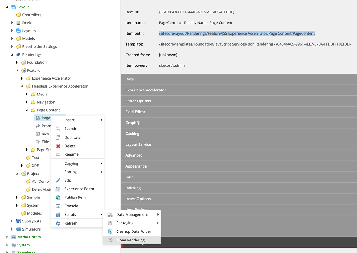
For all other components, the developer must clone the OOTB Page Content component.
/sitecore/layout/Renderings/Feature/JSS Experience Accelerator/Page Content/PageContent
Cloning Process
Once your module is created (This should be the Project layer module created during the Site Collection creation step), you can copy and customize your rendering:
- Navigate to the rendering you want to use based on the decision tree above.
- Right click the rendering item and select
ScriptsthenClone Rendering

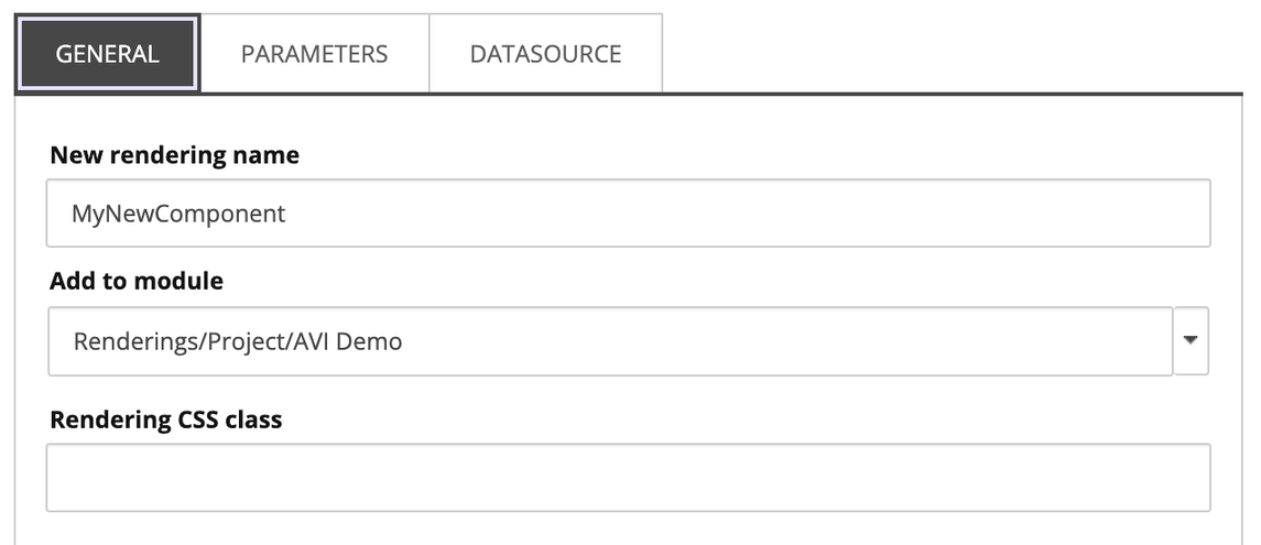
- In the dialog, set the name of the component
(New rendering name), then change the Add to module to the project layer folder created for theSite Collection

- On the
ParametersandDatasourcetabs, the options are changed to make copies of the originals:


- Click
Proceed. This will create and configure all the required items for the component. - Locate the matching
.tsxfile in the Next.js application (Promo.tsxorPageContent.tsx) - make a duplicate of the file and rename to match your new component name. Move the new.tsxfile to a folder structure that matches the rendering item structure.
Now you have the scaffolding for your component, you can customize your data model (datasource template), the rendering parameters & the react component to match.
Making the Component Available
To make the component available in your site, complete the following steps:
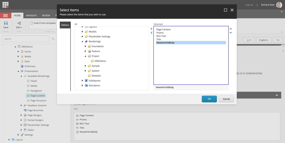
- Locate the
Available Renderingssection of your site. - Find the
Available Renderingsitem that matches your component, or create a new one if required. - Add your component to the
Renderingsfield.

Discussion
Supporting XM Cloud Editor Features
XM Cloud comes with advanced editing features for content authors, to support these features, the data for the rendering parameters is passed into the layout service response from GraphQL. JSS passes these params to your components as props. These parameters are surfaced as CSS Class Names for your grid and optional styles.
To make sure that your components support the advanced editing features of XM Cloud, you must decorate your components with the class names passed through, and ensure that the corresponding CSS is there to support the styles & grid.
<div className="{`component" promo ${props.params.styles}`} id="{id" ? id : undefined}>
  <p>Component Markup Here</p>
</div>
Component Structure
A component should match the following structure:
import React from 'react';
import { Image as JssImage, Link as JssLink, RichText as JssRichText, ImageField, Field, LinkField, Text } from '@sitecore-jss/sitecore-jss-nextjs';

interface Fields {
  MyImageField: ImageField;
  MyTitleField: Field<string>;
  MyLinkField: LinkField;
  MyRichTextField: Field<string>;
}

type ComponentProps = {
  params: { [key: string]: string };
  fields: Fields;
};

const MyComponentDefaultComponent = (props: ComponentProps): JSX.Element => (
  <div className={`component my-component ${props.params.styles}`}>
    <div className="component-content">
      <span className="is-empty-hint">Your component requires a datasource item assigned. Please assign a datasource item to edit the content.</span>
    </div>
  </div>
);

export const Default = (props: ComponentProps): React.JSX.Element => {
  const id = props.params.RenderingIdentifier;
  if (props.fields) {
    return (
      <div className={`component my-component ${props.params.styles}`} id={id ? id : undefined}>
        <JssImage field={props.fields.MyImageField} />
        <div>
          <h2>
            <Text field={props.fields.MyTitleField} />
          </h2>
          <JssRichText field={props.fields.MyRichTextField} />
          <JssLink field={props.fields.MyLinkField} />
        </div>
      </div>
    );
  }

  return <MyComponentDefaultComponent {...props} />;
};- At the top, there are any required
imports - Next, define the interface for the
Fieldsin use on your component. These fields should use the JSS SDK field types that match the Sitecore field types in use. - Define a
typethat will hold the props passed in to the component from theJSS Component Factory. This type should have at least the following 2 properties:params: { [key: string]: string };- this will contain all the rendering parameters for the component in a key value pair.fields: Fields- these are the fields from your datasource item or context item defined in theFieldsinterface above. If your component does not use a datasource item and only gets data from the current context item or from an external source, you can leave this off the props.
- For components with a datasource item, it is recommended to have a default version of the component that is displayed when a datasource item is not assigned. This will prevent errors from happening in the event that a component is added without the datasource item being assignd.
- In the code sample, this is called
MyComponentDefaultComponentnote that a helpful message is displayed to the content editor when this happens.
- In the code sample, this is called
- Then we get the main component structure. This follows the standards for decoration with the XM Cloud grid and styles CSS class names to support those features. Also, fields should be rendered using the JSS SDK to ensure that they are editable in Pages.
- It's important to note that we are not using the JavaScript
default exportstatement here, we are just exporting a function calledDefault, this is important to be able to support Headless Variants, discussed below.
Headless Variants
When creating new components, sometimes we need to provide multiple presentations of the same content. We can achieve this by creating variants of a single component.
An example might be a Promo style of component where you might want to display an image on the left, and text content on the right, but also have the option of an image on the right with text content on the left.
Creating a variant is a two-step process. First, you create the code for the variant in the component's tsx file. Then create a variant definition in the Content Editor with a matching name. Headless variants are site specific and live under: \sitecore\content\<Site Collection>\<Site Root>\Presentation\Headless Variants. See Create a variant for a component | Sitecore Documentation for details.
Which JSS fields to use
| Sitecore field type | JSS React component |
|---|---|
| Date | Date |
| File | File |
| Image | Image |
| General Link | Link |
| Single-Line Text, Multi-Line Text, or numeric types | Text |
| Rich Text | RichText |
External Data
External data is handled in its own recipe: External Data Integration