Problem
Using placeholders in Sitecore XM Cloud is beneficial because they offer flexibility, reusability, and scalability. They allow dynamic content insertion, support personalized experiences, and maintain consistent design. Placeholders also simplify development and maintenance, making it easier to manage and update content while ensuring a modular and scalable site structure.
This recipe will detail out what Placeholders we have available, how have they been used in the XM Cloud Starter Kit and how to create custom Placeholders while adhering to best practice.
Solution
There are two types of placeholders Static and Dynamic and we will cover both in this recipe:
-
Static Placeholders have a fixed key and the name remains the same on each use. Ideal to use when a single instance is needed on a page or when the layout structure is simple.
-
Dynamic Placeholders have a unique key for each instance which allows the same placeholder to be used multiple times with the same or different renderings. Ideal use if for more complex layouts where Placeholders are used multiple times as each instance is uniquely identified without conflicts.
Placeholder component
Within JSS Next.js applications the most common ways to work with placeholders is using the Placeholder component. There are several ways to use placeholders within you applications you can read more here.
import { Placeholder } from '@sitecore-jss/sitecore-jss-nextjs';
const App = ({ rendering }) => (
  <div>
    <h1>My App</h1>
    <Placeholder name="jss-main" rendering={rendering} />
  </div>
);
This is an example of a static placeholder and if you look at the Layout.tsx in the XM Cloud Foundation Head Starter Kit the Placeholder component is used to render the root placeholders for the application.
<div className={mainClassPageEditing}>
  <header>
    <div id="header">{route && <Placeholder name="headless-header" rendering={route} />}</div>
  </header>
  <main>
    <div id="content">{route && <Placeholder name="headless-main" rendering={route} />}</div>
  </main>
  <footer>
    <div id="footer">{route && <Placeholder name="headless-footer" rendering={route} />}</div>
  </footer>
</div>
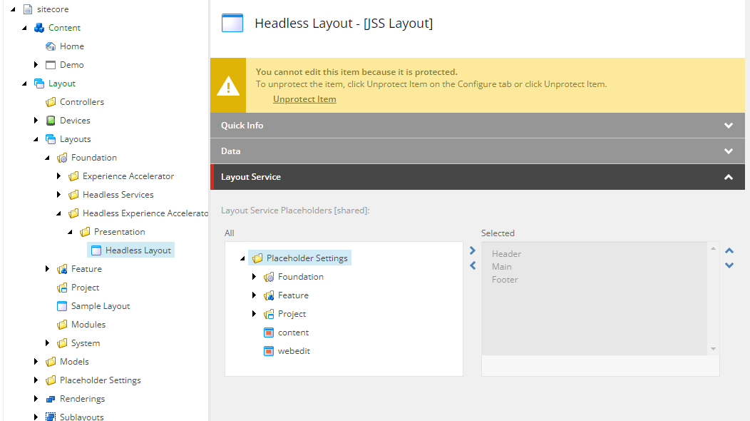
These are the default placeholders configured by Headless Experience Accelerator (SXA) and can be seen on the Headless Layout. It is recommended to not change the default layout as this can lead to breaking changes and potential challenges during upgrades. The use of Page and Partial can be used instead for these kind of customizations and will ensure stability, maintainability and future proofing.

Placeholder Restrictions
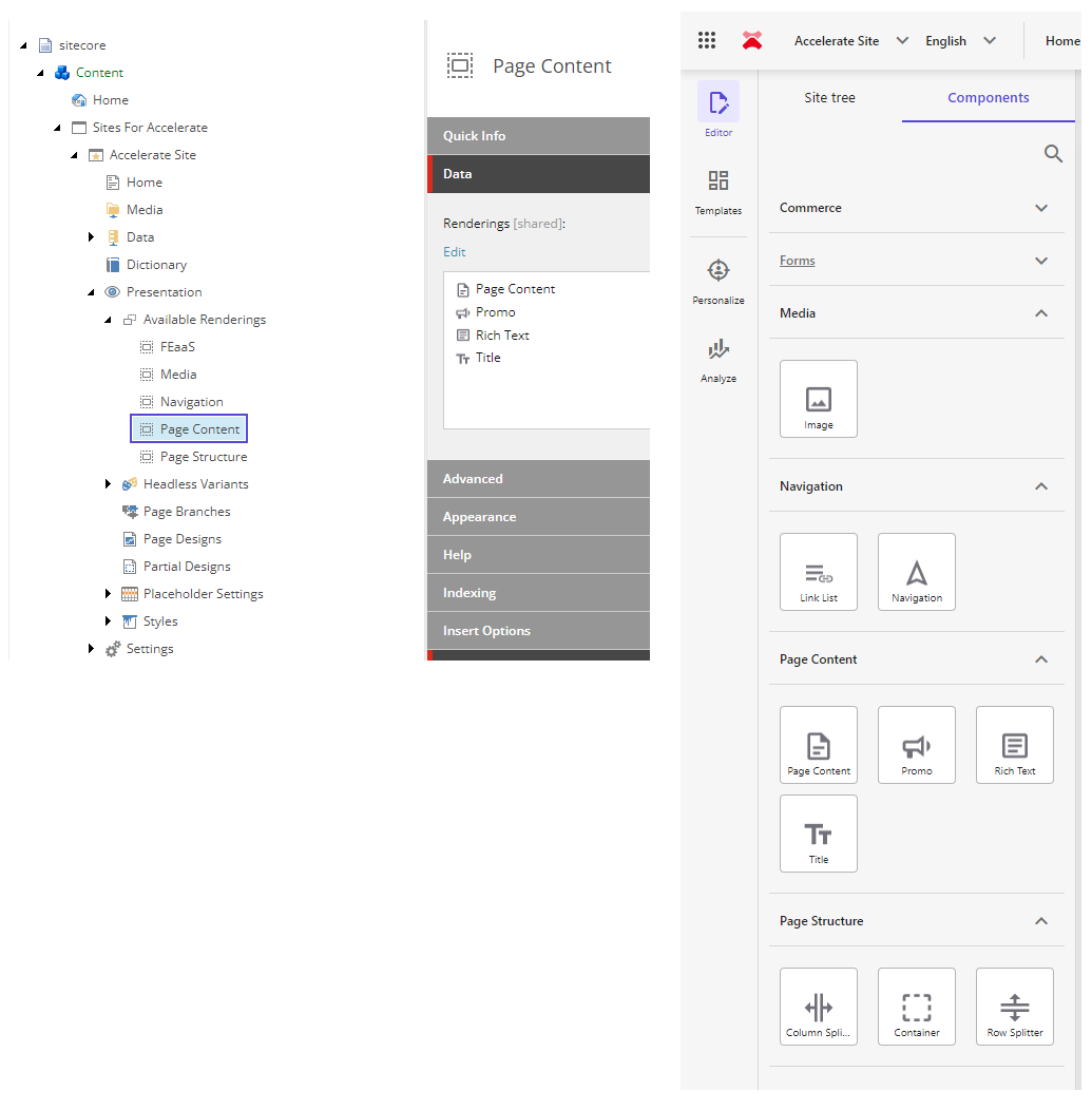
SXA enables content owners to construct web pages by dragging renderings from the Components tab to the page. When you click and start dragging a rendering, the placeholders where you can drop the rendering light up in blue.
To have some control over the renderings that can be placed in a placeholder, you can set placeholder restrictions.

What are Available Renderings?
Available renderings are components that you can use to display content on your web pages. They are pre-configured and made accessible within the Sitecore CMS, allowing content editors to easily add and manage them on different pages.

SXA Partial Design Placeholders
The PartialDesignDynamicPlaceholder in Sitecore XM Cloud is a feature that allows you to use dynamic placeholders within partial designs. This is particularly useful for creating flexible and reusable page designs where components can be dynamically inserted.
You can see the PartialDesignDynamicPlaceholder.tsx in the XM Cloud Foundation Head starter kit.
import React from 'react';
import { Placeholder, ComponentRendering } from '@sitecore-jss/sitecore-jss-nextjs';

type DynamicPlaceholderProps = {
  rendering: ComponentRendering;
};

const PartialDesignDynamicPlaceholder = (props: DynamicPlaceholderProps): JSX.Element => (
  <Placeholder name={props.rendering?.params?.sig || ''} rendering={props.rendering} />
);

export default PartialDesignDynamicPlaceholder;
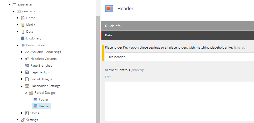
When creating partial designs you will see a corresponding placeholder item which is automatically created under Placeholder Settings > Partial Design. Also notice the placeholder key created.

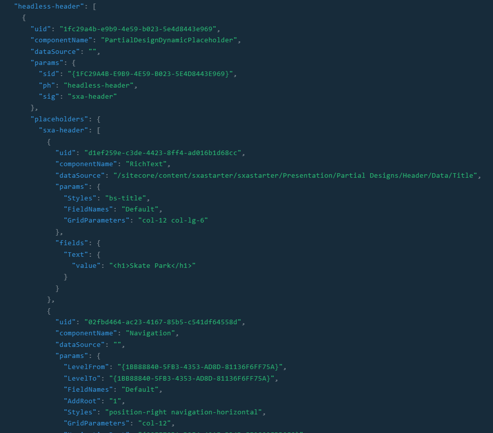
You can see an example of the structure created here by running a GraphQL query to obtain the Layout Service output.

Steps to Add Placeholders in the Content Tree
- Navigate to the Placeholder Settings:
- Go to the Content Tree in the Sitecore CMS.
- Navigate to /sitecore/Layout/Placeholder Settings. This is where you will manage all your placeholder settings usually in Feature or Project folders.
- Create a New Placeholder:
- Right-click on the Placeholder Settings folder and select Insert > Placeholder.
- Name your placeholder appropriately. For example, if it’s for a header section, you might name it header-placeholder.
- Configure the Placeholder:
- After creating the placeholder, you need to configure it. This involves setting the allowed renderings and any other specific settings.
- In the Content Editor, select your newly created placeholder item.
- In the Allowed Controls section, specify which renderings can be placed in this placeholder.
- Link the Placeholder to a Layout or Rendering:
- Navigate to the layout or rendering where you want to use this placeholder.
- In the Placeholder Key field, enter the key of your new placeholder (e.g.header-placeholder).
Using Dynamic Placeholders
If you need to use dynamic placeholders, which generate unique keys for each instance, follow these additional steps:
- Enable Dynamic Placeholders:
- In the content tree, navigate to the component you want to enable dynamic placeholders for.
- Add the IsRenderingsWithDynamicPlaceholders property to the component item and set its value to true.
- Define Placeholder Key with Wildcards:
- In the placeholder settings item, define the placeholder key using a wildcard. For example,
myrendering-{*}. - This allows the system to generate unique keys like myrendering-1, myrendering-2, etc., for each instance.
- In the placeholder settings item, define the placeholder key using a wildcard. For example,
Examples of dynamic placeholders can be seen in the Container.tsx file in the XM Cloud Foundation Head starter kit.
import {
  ComponentParams,
  ComponentRendering,
  Placeholder,
} from '@sitecore-jss/sitecore-jss-nextjs';
import React from 'react';
interface ComponentProps {
  rendering: ComponentRendering & { params: ComponentParams };
  params: ComponentParams;
}
const DefaultContainer = (props: ComponentProps): JSX.Element => {
  const containerStyles = props.params && props.params.Styles ? props.params.Styles : '';
  const styles = `${props.params.GridParameters} ${containerStyles}`.trimEnd();
  const phKey = `container-${props.params.DynamicPlaceholderId}`;
  const id = props.params.RenderingIdentifier;
  const mediaUrlPattern = new RegExp(/mediaurl=\"([^"]*)\"/, 'i');
  const backgroundImage = props.params.BackgroundImage as string;
  let backgroundStyle: { [key: string]: string } = {};
  if (backgroundImage && backgroundImage.match(mediaUrlPattern)) {
    const mediaUrl = backgroundImage.match(mediaUrlPattern)?.[1] || '';
    backgroundStyle = {
      backgroundImage: `url('${mediaUrl}')`,
    };
  }
  return (
    <div className={`component container-default ${styles}`} id={id ? id : undefined}>
      <div className="component-content" style={backgroundStyle}>
        <div className="row">
          <Placeholder name={phKey} rendering={props.rendering} />
        </div>
      </div>
    </div>
  );
};
export const Default = (props: ComponentProps): JSX.Element => {
  const splitStyles = props.params?.Styles?.split(' ');
  if (splitStyles && splitStyles.includes('container')) {
    return (
      <div className="container-wrapper">
        <DefaultContainer {...props} />
      </div>
    );
  }
  return <DefaultContainer {...props} />;
};
Best Practices
- Consistent Naming: Use clear and consistent naming conventions for your placeholders to avoid confusion.
- Organize Placeholders: Keep your placeholders organized within the Placeholder Settings folder to make them easy to manage.
- Test Thoroughly: Always test your placeholders to ensure they work as expected and render the correct components.